
Have you ever admired the sleek, subtle blur effect on iPhone or MacBook lock screen, where the text seemingly floats above a blurred background?  It looks great and adds a nice touch of depth and style.
  And guess what? You can recreate a similar effect in your web applications!

Let’s break down each part of this: 
-webkit-mask: linear-gradient(#fff 0 0) text; and mask: linear-gradient(#fff 0 0) text;
- This is the crucial part. We’re using CSS masking to define the area where the element will be visible.
linear-gradient(#fff 0 0)creates a solid white (100% opaque) gradient.texttells the mask to use the shape of the text itself as the mask. Only the parts of the element underneath the white text will be visible.- The
-webkit-maskis for older browser compatibility (though often not necessary now).
backdrop-filter: blur(16px);
This applies the blur effect to the content behind the element. The 16px value controls the blur intensity. Adjust this to your liking!
color: hsla(0, 0%, 100%, .7);
This sets the color of the text. I’ve used hsla(0, 0%, 100%, .7) for a semi-transparent white, which works well on most backgrounds. You can change this to any color you want, but a lighter color generally works best with a blur effect.
font-size: 4em; and font-weight: bold; 
These are just for text styling to make it more prominent. Adjust them to fit your design.
display: inline-block;
Very Important: This is often necessary for the masking to work correctly, especially with text elements. It ensures the element takes up only the space needed for its content.
HTML Structure :
<div style="background-image: url('your-background-image.jpg'); width: 100%; height: 300px; display: flex; justify-content: center; align-items: center;"><br>
    <span class="blurred-text">Hello, World!</span><br>
</div>
Explanation of the HTML:
- We have a container
divwith a background image. This is what will be blurred behind the text. - We use flexbox to center the text horizontally and vertically. This is just for demo purposes; adjust the layout as needed.
- The
spanelement contains the text and has theblurred-textclass applied to it.
How it Works Together 
- The
backdrop-filterblurs everything behind the text. - The
maskproperty restricts the visibility of the blurred content to the shape of the text itself.
Browser Compatibility 
backdrop-filteris supported in most modern browsers (Chrome, Firefox, Safari, Edge). Check CanIUse for the latest compatibility information.- CSS masking (
maskproperty) also has good support, but it’s always a good idea to test in your target browsers.
Customization Tips 
- Blur Radius: Experiment with different
blur()values in thebackdrop-filterto find the perfect level of blur. - Text Color: Adjust the
colorproperty to ensure the text is readable against the blurred background. - Background: The type of background you have will greatly impact the look of the final effect. Images with lots of detail or contrast will produce the most interesting results.
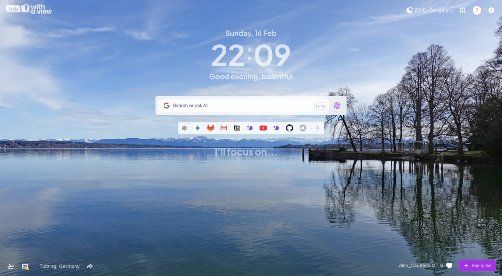
WithAView and the Power of Visual Details 
During my time working with WithAView (you can find out more about them at https://withaview.co/ext/), I gained a deeper understanding of how subtle visual details can elevate the user experience. Effects like this blur are a perfect example of how small touches can add a layer of depth and polish the design.
Conclusion 
By combining the backdrop-filter and mask properties, you can easily create a stunning text blur effect that mimics the look of the iPhone or MacBook lock screen. It’s a simple technique that can add a touch of elegance and modernity to your web applications.
Give it a try, and let me know in the comments how it works for you!
Happy coding! 
